We design and develop some non-refresh websites (such as the use of ajax, pjax and other technologies). They may include some page transition and effects and animations which improve the site’s user experience and ploy of interface heavily, allowing users to stay longer. This is also a great way to increase content marketing. I might have found the start of a new trend in 2018 involving an interesting and unusual kind of page transition and effects that are very interesting, especially when we’re using the effects to tell stories or sell your products.
1. Disorganized Animation Based On SVG
When you click on the navigation menu, the whole page of the SVG is not a normal shape. Switching smoothly between the two ways of exploring the story and page content you have at your disposal. The result of this is to bring an unprecedented freshness.
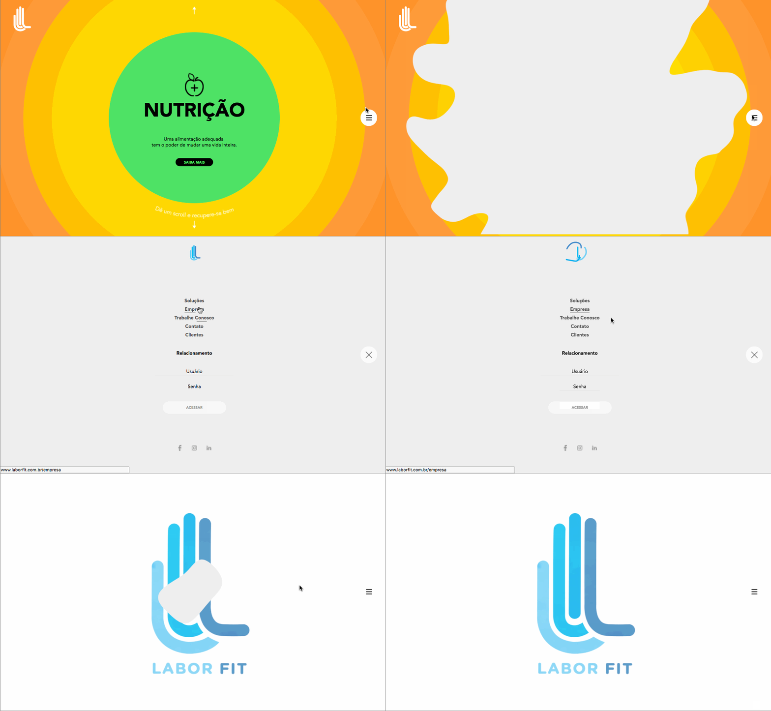
Example:Labor Fit Company
2. Depth Of Focus Effect
The elements of the page or the primary character, and even the background image to the depth of field animation to switch in order to make a parallax effect.
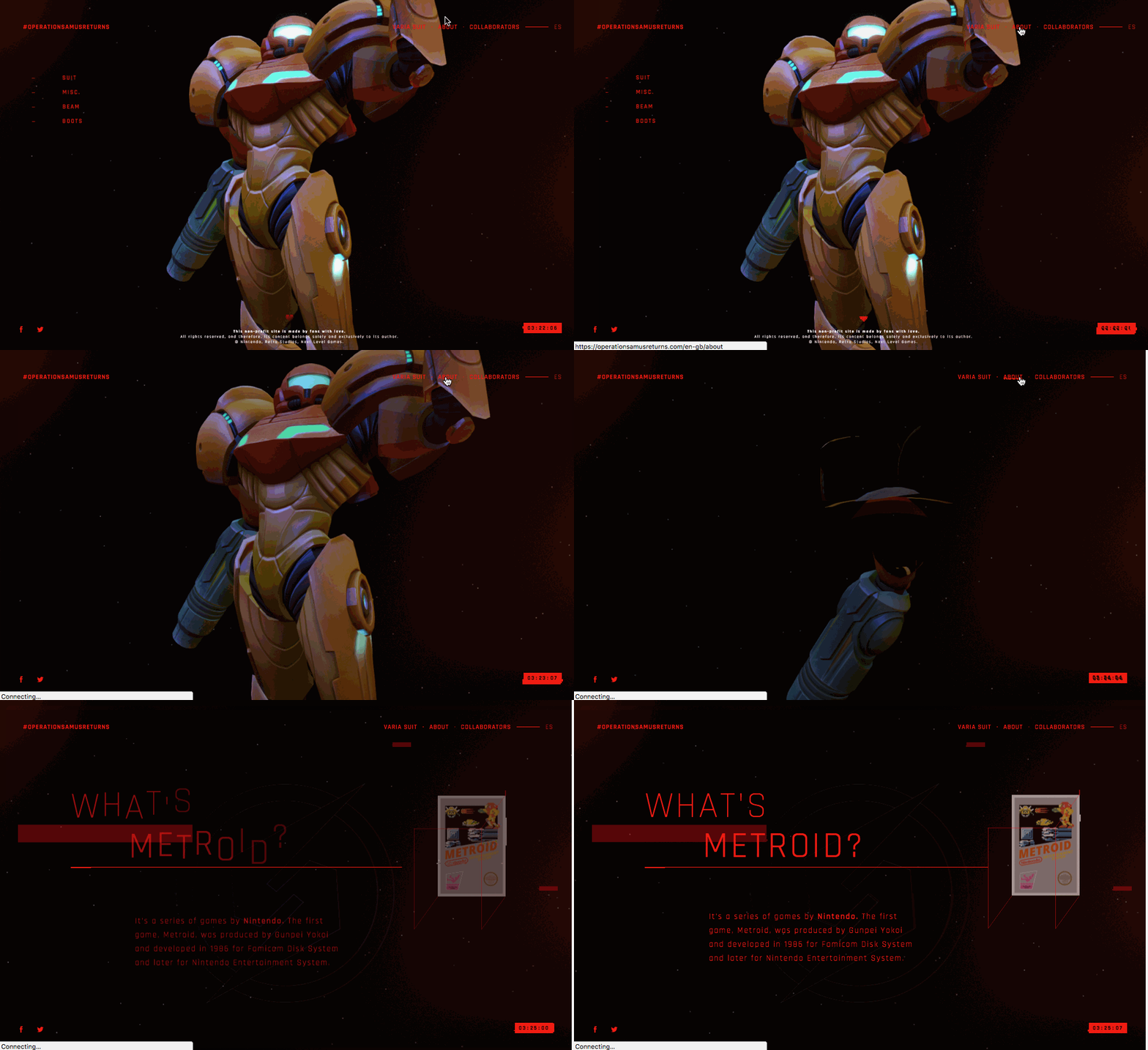
Example:OPERATIONSAMUSRETURNS
3. Animation of Page Coordinate Positioning Spy
The point transitions are very nice and took advantage of that. Accurate positioning of the product or the site’s target audience, help to make users find the focus of the page.
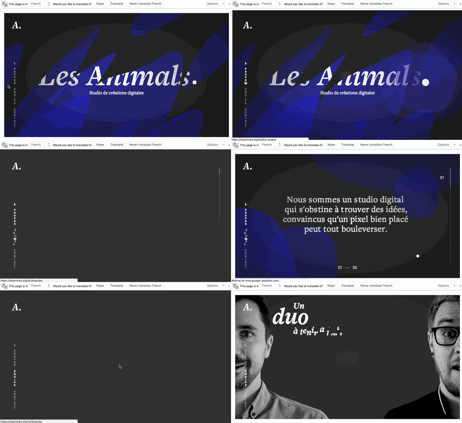
Example:Les Animals Studio
4. Smooth And Continuous Shape Change
Very rhythmic and step-by-step transition effect, so that the user’s focus is changing. At the same time make the site more interesting.
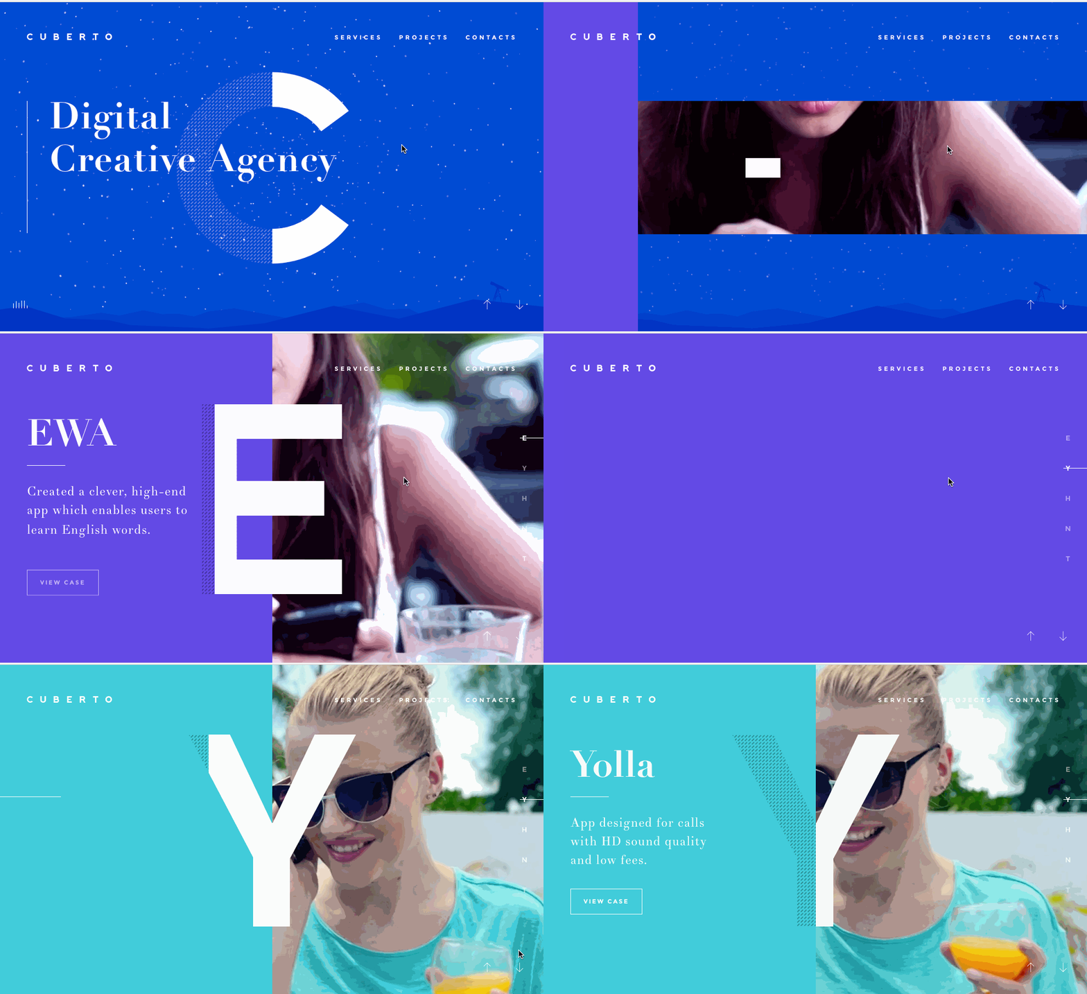
Example:Cuberto — Interactive Design Studio
5. Vertical And Continuous Mask Display & Hide
Using non-refresh mask layer queue to hidden or display the content. If you use this way to navigate, you can know more clearly where you are on the page.
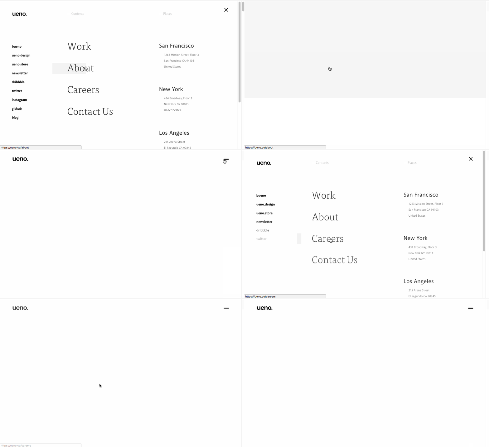
Example:Ueno. Digital agency
6. Horizontal And Continuous Mask Display & Hide
Similar to the previous effect with excellent user experience.
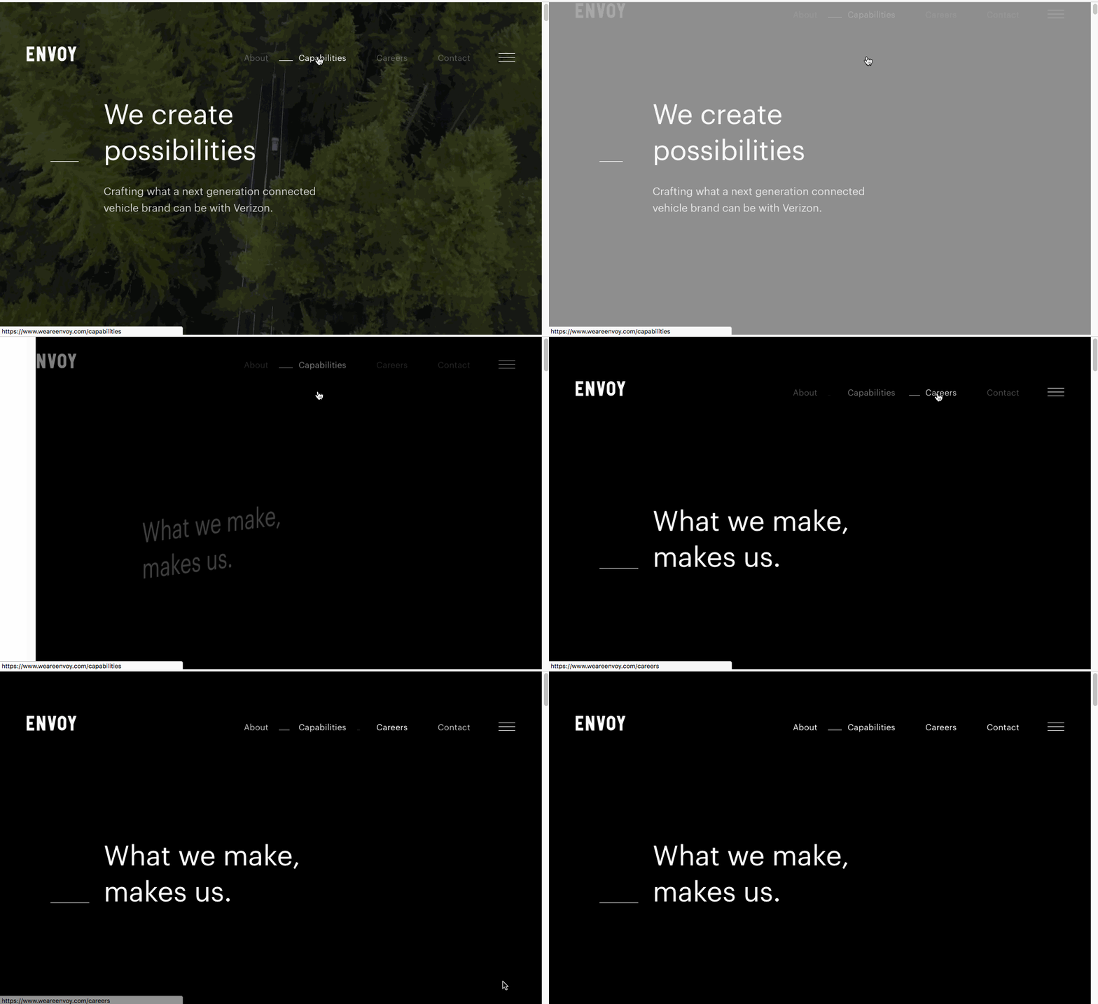
Example:ENVOY
7. The Transition Of Direction, Rotation or Position Move
Very creative expression and giving the immediate feeling. The experience really shocking when I saw this site. The most prominent is animation of the page rotation and background color change.
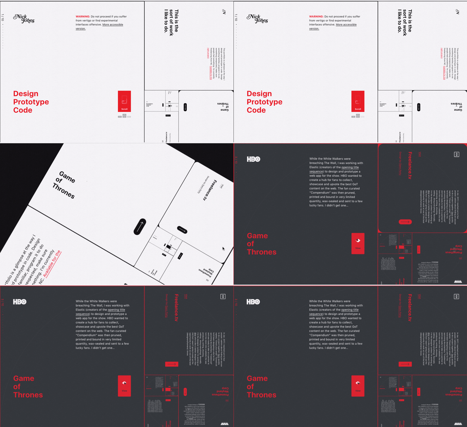
Example:Nick Jones – Interface Prototyper / Designer
8. Perspective And Scene Switch
Allowing users a glance and harmonious product guide. From the whole experience, the page highlight the clear steps and text introduction.
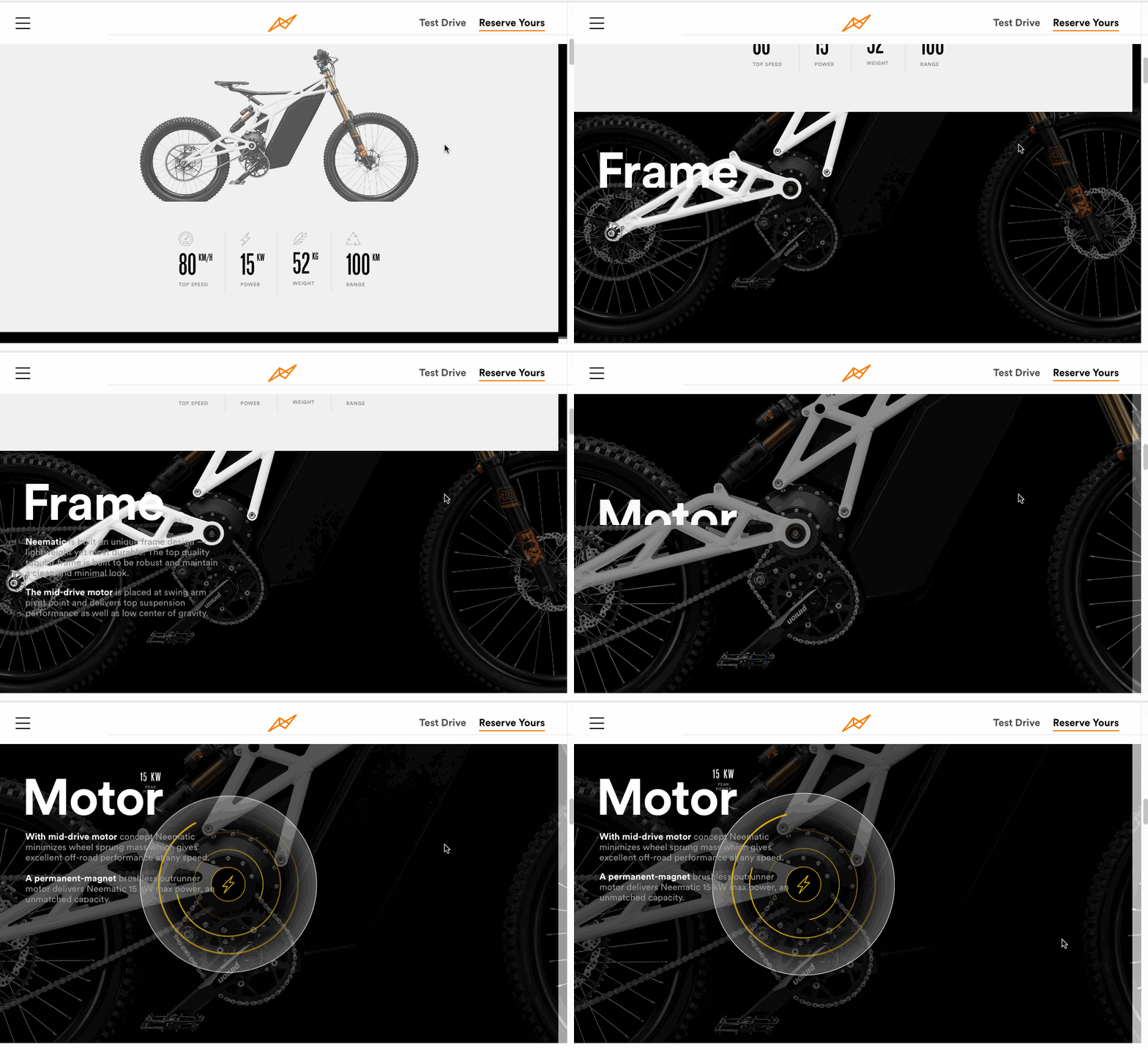
Example:Neematic Bike
9. Variety Of Smooth And Continuous Shape Change
A little blind feeling. Common in the slider, but here used in the page transition animation, I think it is an application of cross-thinking skills. Good work!
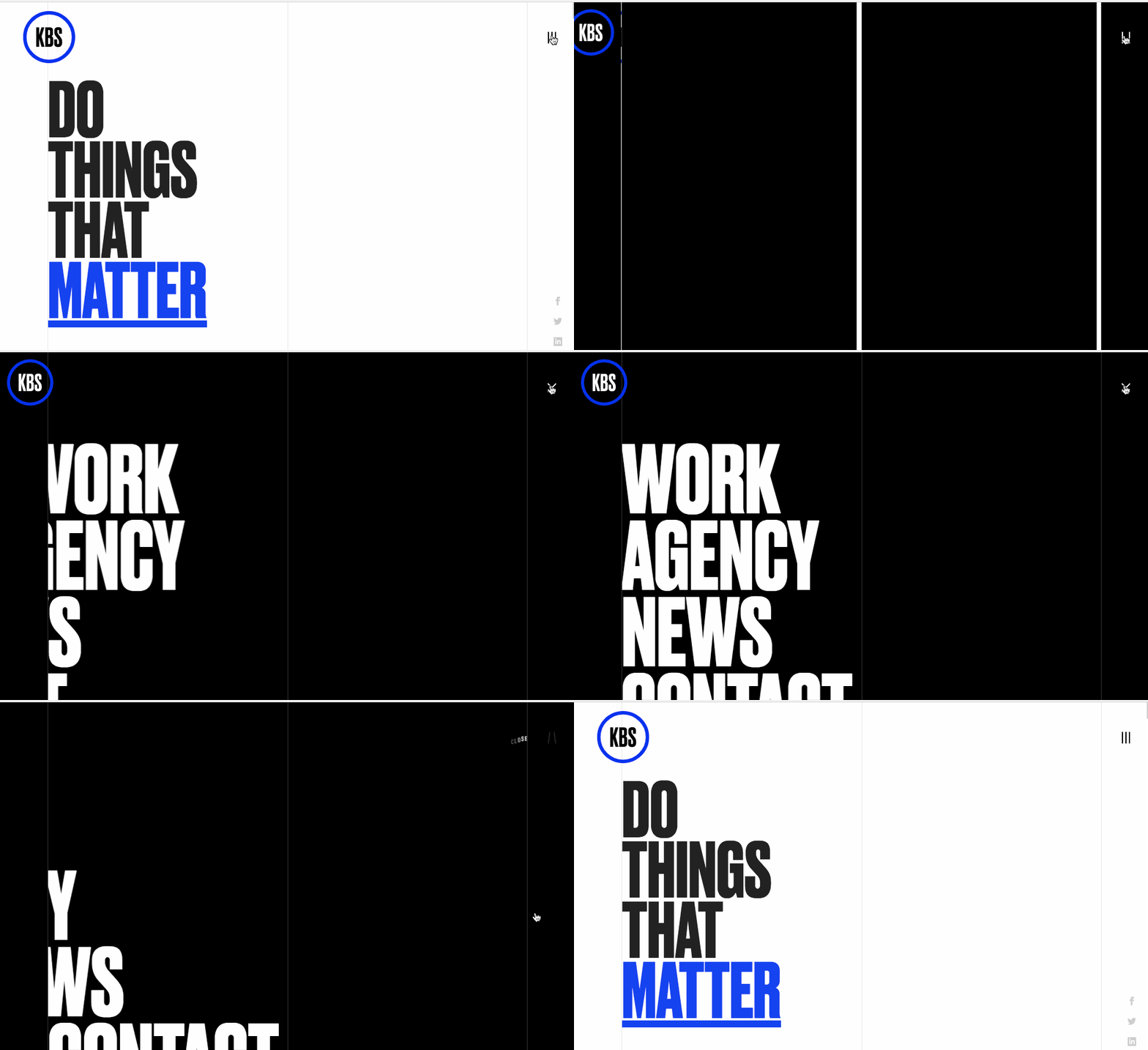
Example:Do Things That Matter — KBS Canada
10. Easing Animation With Parallax
The page has comfortable easing and parallax effects. The combination of multiple transitions also makes the page look real and highly creative.
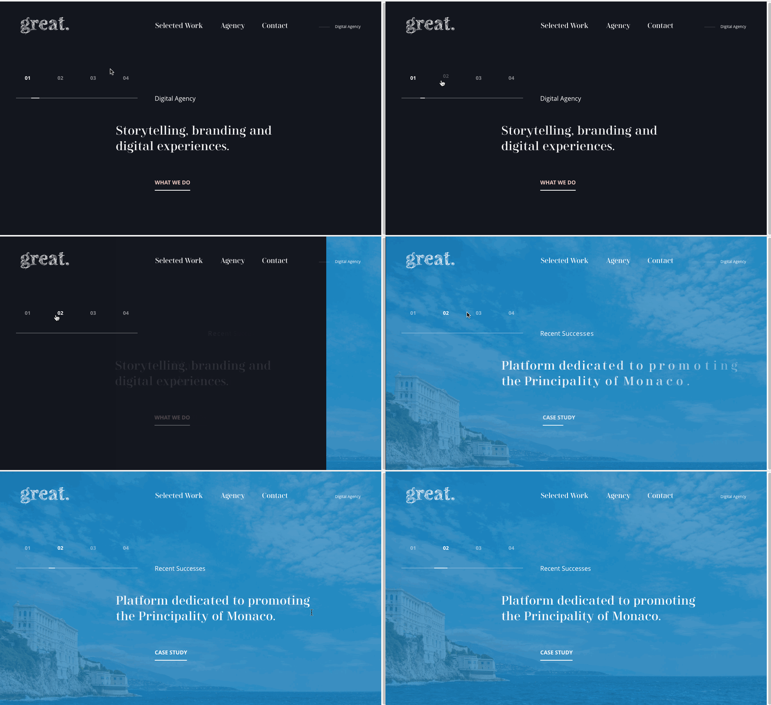
Example:The Great Agency
I hope this article will give you more inspiration and improve design and development capabilities. Like it? You can follow me if you want, thanks. 🙂

