
Now this era of rapid development of science and technology. The design considerations are also more and more. While almost all major apps for OSX have been updated already to appear in a super crisp look, the web still isn’t retina ready at all. No hign resolution’s website almost is behind The Times. I really see High-resolution displays are the future. So, I need to add high-resolution images to the sites I design. We use media queries to serve larger images to retina devices, and zooming my browser won’t trigger these media queries.
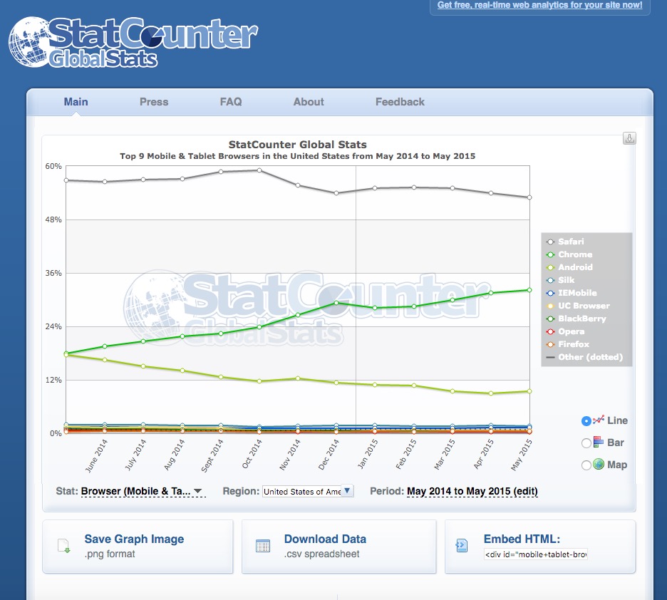
A good tool for checking high-level country-level stats is Statcounter’s service, here’s for example the graph for mobile and tablet OS market shares for the US:
I tried many ways finally found a feasible. I am very happy. Is there any simulator application or tool to test web pages for retina display?
There is a wonderful way to test your websites for retina by google chrome without an actual retina display. Naturally, it is always best to test your website using the actual devices so that you can actually see what’s really going on with your website.
In a nutshell
- Emulate your site across different screen sizes and resolutions, including Retina displays.
- Responsively design by visualizing and inspecting CSS media queries.
- Evaluate your site’s performance using the network emulator, without affecting traffic to other tabs.
- Accurately simulate device input for touch events, geolocation, and device orientation
Check out Google Developers- Simulate Mobile Devices with Device Mode
Let’s take a look at. In chrome you can do it by:
Your testing require version of Chrome is at least to 48.0.
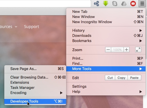
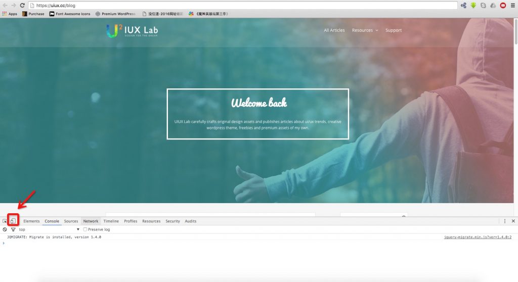
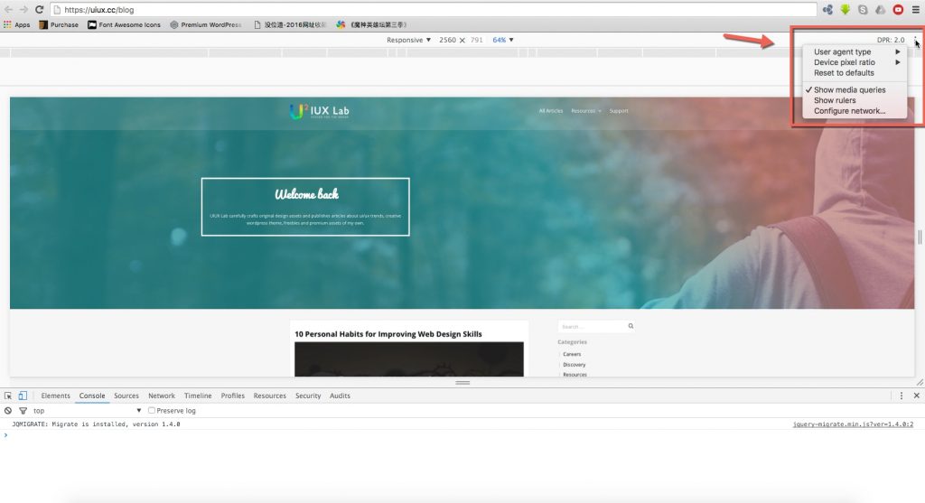
1. Open up Chrome “Developer Tools” and click on the little “Toggle device mode” icon.
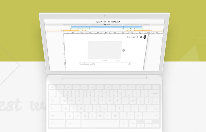
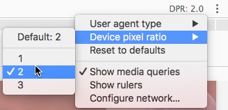
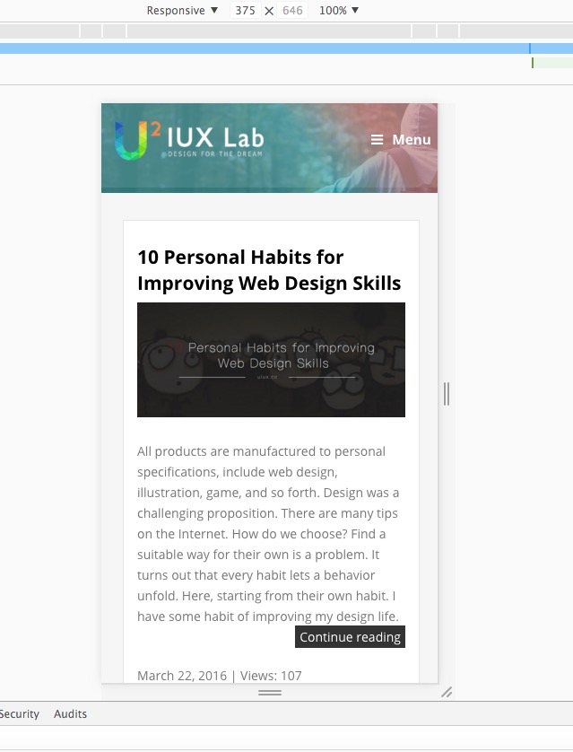
2. Use Chrome DevTools’ Device Mode to build mobile-first, fully responsive web sites. Learn how to use it to simulate a wide range of devices and their capabilities. Change it to your desired ratio (1 for normal, 2 for retina, etc.)
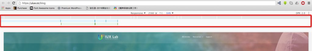
3. Select the approprite resolution on the horizontal axis from top of the chrome browser.
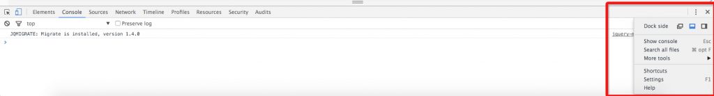
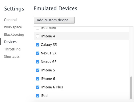
Chrome has received a number of improved mobile emulation tools which can be accessed by enabling the General and Devices panel through the Settings panel.
Remember
Device Mode does a whole lot to give you an experience as close as possible compared to the real deal, but keep in mind that you’ll still need to test on real devices to get the full picture (we can’t yet emulate the performance characteristics of a real device).
Through the abouve points we have a good way to test your website, and, this will improve the efficiency of our design greatly. So cool! Thank you for your reading. 🙂
Leave a Reply